Try Whale Odyssey
Explore the interactive prototype below. For more room on a small screen, open it in Figma using the button above.
Problem and solution
The design challenge
How could families and other visitors learn about whales while on a tour? The app needed to make information easy to find, offer meaningful activities between sightings, and be usable while visitors were on a moving boat.
Audience research
Who I designed for
I used two design personas to think through what different visitors might want from the same whale-watching trip.
Primary persona
Jennifer Clarkson
Jennifer plans educational outings for her children. She needs marine life information she can find quickly and activities the family can explore between sightings. The short facts and games give her two ways to keep that learning going.
Secondary persona
Roger Grayson
Roger is a retired traveller and beginning photographer who wants to capture memories for his grandchildren. I considered his preference for straightforward navigation and readable text when designing the information hierarchy and the paths to sightings and souvenirs.
Design decisions
Learning in short, focused steps
I separated the marine life explorer into two decisions: choose an animal category, then choose a species. Short facts and games offered different ways to explore the content. The game used stationary on-screen controls so visitors could play without tilting their phone on the boat.
Design and development process
What changed after user testing
Testing helped me select the clearest features from two interface versions. I kept the facts and games from one version and the sightings and souvenir flows from the other.
- Make controls easier to find. I enlarged the audio icon and used a teal underline to show the active tab.
- Make progress easier to check. I moved scores and badges into the game menu so users could reach them during play.
- Clarify what happens after purchase. I added visible checkout steps and an order number for souvenir pickup.
Visual design system
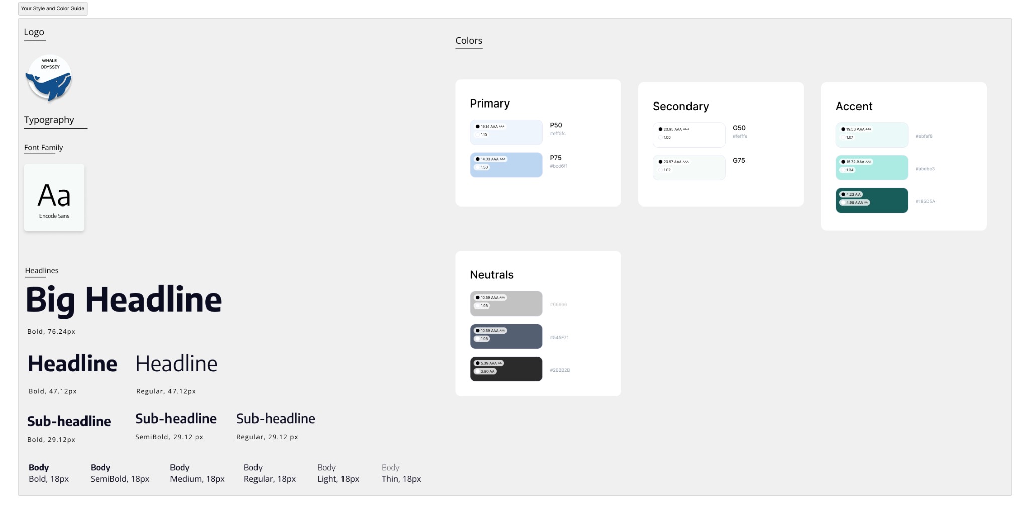
The style guide uses a clear type hierarchy and a pale blue, white, and teal palette. Teal helps signal interactive elements.